What a Million Calls to 311 Reveal About New York
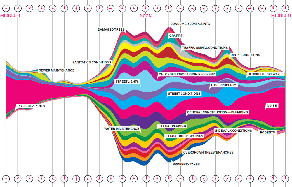
You may have seen the image below in Wired magazine or at the Museum of Modern Art in Manhattan. The Wired article was titled “What A Hundred Million Calls to 311 Reveal About New York”. Stream graphs first gained attention in 2008 when The New York Times published Ebb and Flow of Movies: Box Office Receipts Over past 20 Years.
Aesthetically stream graphs are appealing. Within the data visualization community, some have questioned their legibility, calling them unnecessarily complex. In his blog Visualizing Data, Andy Kirk looked into the history of stream graphs and the polarized response to them. Looking at the graph of 311 calls, I wanted to know more. How do complaints vary by neighborhood? Would calls from the poorest neighborhoods reveal something about New York? The Wired graph used only one week of calls from early September, 2010. In order to answer these questions I would have to obtain more data.
Source:
http://www.wired.com/2010/11/ff_311_new_york/
###Step 1: Understanding the data
I wanted to include data for a full year and see if I could link it to poverty statistics from the most recent (2013) 3-year American Community Survey. Census data and 311 data do not line up exactly because the Census Bureau uses “census tracts” and 311 data is provided by zip code and GPS coordinates. However a geographer at Baruch CUNY has done the work of assigning NYC zip codes to census boundaries based on a number of factors. For more information on this, refer to the excellent “Guide to NYC Neighborhood Census Data” listed below under References.
Data sources:
NYC OpenData
Reformatted ACS poverty data
Zip code-to-PUMA ID mapping
require("dplyr")

#--------------------------------
#  Read and clean ACS poverty data
#--------------------------------
setwd("./DATA")
poverty <- read.csv("nyc_poverty_2013.csv", header=TRUE, stringsAsFactors=FALSE)
for (i in 1:ncol(poverty))
    names(poverty)[i] <- poverty[1,i]
xvals <- which(poverty[2,] == "(X)")
poverty_data <- poverty[-1,-xvals]
poverty_data$PUMA_ID <- as.factor(poverty_data$PUMA_ID)
for (i in 5:42)
    poverty_data[,i] <- as.numeric(poverty_data[,i])

#--------------------------------
#  Read and clean 311 data
#--------------------------------
nyc311_df <- read.csv("~/DATA/311_Service_Requests_from_2010_to_Present.csv", stringsAsFactors=FALSE)
names(nyc311_df)[6] <- "ComplaintType"
names(nyc311_df)[9] <- "Zipcode"

## Add categories
poverty_data$FamPvCategory  <- cut(poverty_data$FamBwPvP,   breaks=c(0,10,20,30,40,50,60), labels=c( "[0-10%)", "[10-20%)","[20-30%)", "[30-40%)", "[40-50%)", "[50-60%)" ), include.lowest=TRUE)
poverty_data$ChldPvCategory <- cut(poverty_data$FCU18BwPvP, breaks=c(0,10,20,30,40,50,60), labels=c( "[0-10%)", "[10-20%)","[20-30%)", "[30-40%)", "[40-50%)", "[50-60%)" ), include_lowest=TRUE)
poverty_data$EldPvCategory  <- cut(poverty_data$P65plBwPvP, breaks=c(0,10,20,30,40,50,60), labels=c( "[0-10%)", "[10-20%)","[20-30%)", "[30-40%)", "[40-50%)", "[50-60%)" ), include_lowest=TRUE)
poverty_all_df  <- poverty_data[,c(1,2,4,43)]
poverty_chld_df <- poverty_data[,c(1,2,4,44)]
poverty_eld_df  <- poverty_data[,c(1,2,4,45)]
setwd("~/Columbia/nyc-311")
## Attach Census PUMA IDs to 311 data based on a lookup
setwd("../../")
require("qdapTools")
zipcode_to_puma <- read.csv("nyc_zcta10_to_puma10.csv", stringsAsFactors=FALSE)
zipcode_to_puma$zcta10 <- as.character(zipcode_to_puma$zcta10)
nyc311_df$PUMA_ID <- lookup(nyc311_df$Zipcode, zipcode_to_puma[,c(1,4)])
nyc311_df$PUMA_ID <- as.factor(nyc311_df$PUMA_ID)

## Clean up complaint type
nyc311_df$ComplaintType[nyc311_df$ComplaintType == "APPLIANCE"] <- "Appliance"
nyc311_df$ComplaintType[nyc311_df$ComplaintType == "GENERAL CONSTRUCTION"] <- "Construction"
nyc311_df$ComplaintType[nyc311_df$CnmplaintType == "CONSTRUCTION"] <- "Construction"
nyc311_df$ComplaintType[nyc311_df$ComplaintType == "Derelict Vehicles"] <- "Derelict Vehicle"
nyc311_df$ComplaintType[nyc311_df$ComplaintType == "ELECTRIC"] <- "Electric"
nyc311_df$ComplaintType[nyc311_df$ComplaintType == "GENERAL"] <- "General"
nyc311_df$ComplaintType[nyc311_df$ComplaintType == "HEATING"] <- "Heating"
nyc311_df$ComplaintType[nyc311_df$ComplaintType == "NONCONST"] <- "Non construction"
nyc311_df$ComplaintType[nyc311_df$ComplaintType == "PAINT - PLASTER"] <- "Paint/plaster"
nyc311_df$ComplaintType[nyc311_df$ComplaintType == "PAINT/PLASTER"] <- "Paint/plaster"
nyc311_df$ComplaintType[nyc311_df$ComplaintType == "PLUMBING"] <- "Plumbing"
nyc311_df$ComplaintType[nyc311_df$ComplaintType == "STRUCTURAL"] <- "Structural"
nyc311_df$ComplaintType[substr(nyc311_df$ComplaintType,1,5)  == "Noise"] <- "Noise"
nyc311_df$ComplaintType[substr(nyc311_df$ComplaintType,1,11) == "Street Sign"] <- "Street Sign Damaged/Missing"
nyc311_df$ComplaintType[substr(nyc311_df$ComplaintType,1,10) == "Fire Alarm"] <- "Fire Alarm Addn/Modif/Insp"
nyc311_df$ComplaintType[substr(nyc311_df$ComplaintType,1,12) == "Highway Sign"] <- "Highway Sign Damaged/Missing"
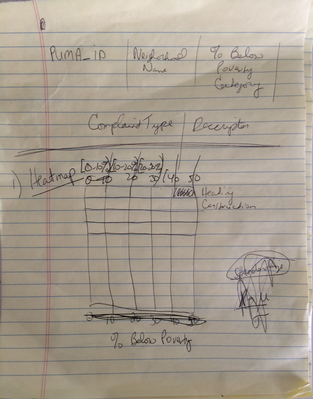
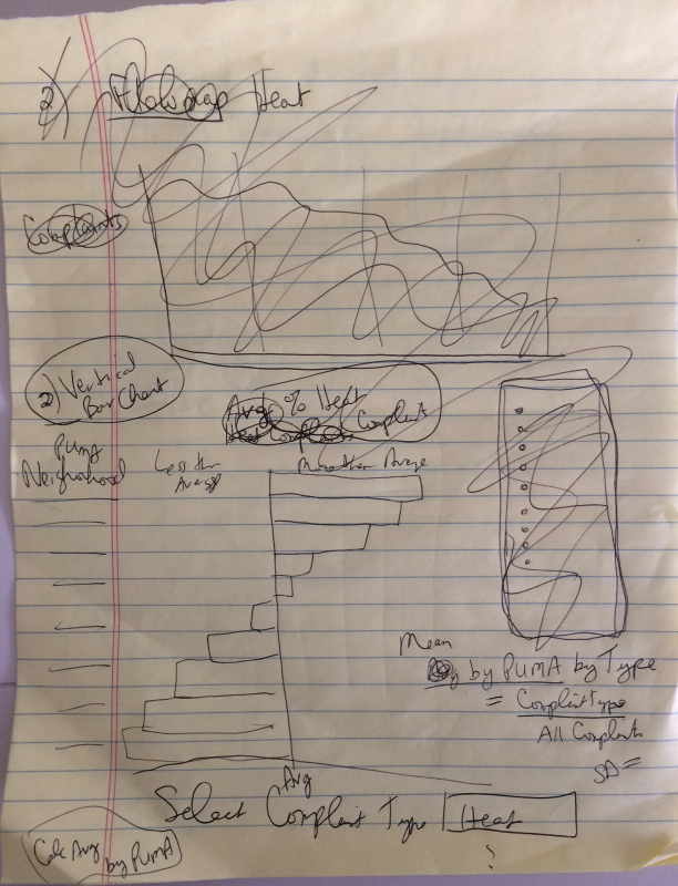
###Step 2: Sketch something
After working with the data and confirming that I could link it, I drew some rough sketches.
###Step 3: Code, test, repeat…
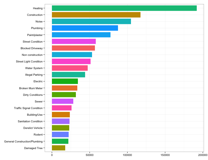
First I made a simple horizontal bar chart showing the top calls to 311 in 2013. Heating is clearly the top complaint.
require("ggplot")
require("ggthemes")

by_ct <- group_by( data, ComplaintType )
ct1   <- summarize( by_ct, n=sum(n) )
top_complaints <- filter( ct1, n > 17000 )
top_22 <- inner_join(ct1, top_complaints, by="ComplaintType")
names(top_22)[2] <- "n"
top_22[,3] <- NULL
top_22 <- top_22[order(desc(top_22$n)),]
ggplot(data=top_22, aes(x=ComplaintType, y=n, fill=ComplaintType, width=2)) +
    geom_bar(width=0.8, stat="identity", position=position_dodge(width=0.40)) +
    coord_flip() +
    guides(fill=FALSE) +
    scale_fill_hue() +
    theme_bw() +
    theme(axis.title.y = element_blank()) +
    theme(axis.title.x = element_blank()) +
    scale_x_discrete(limits=rev(top_22$ComplaintType))
Next I plotted poverty level by neighborhood from the ACS data, and made a heatmap of 311 calls by poverty level, based on the location of the caller. Heating is the top complaint except in neighborhoods where less than 10% of the population had earnings below poverty level. In those neighborhoods, noise was the top complaint.

    libs <- c("ggmap","maps","maptools","RColorBrewer","rgdal","rgeos","sp","scales","plyr","reshape")
    x <- sapply(libs,function(x)if(!require(x,character.only = T)) install.packages(x))
    rm(x,libs)

    #------------------------------------------------------------
    # Bind poverty data to census tract shape files for mapping
    #------------------------------------------------------------
    census_tracts <- readOGR(dsn=".","Columbia_nyct2010ids")
    nyc_shapes <- spTransform(census_tracts, CRS("+proj=longlat + datum=WGS84"))
    nycmap_df  <- fortify(nyc_shapes)
    map_data   <- data.frame(id=rownames(nyc_shapes@data),
                    PUMA_ID=nyc_shapes@data$puma,
                    GEO_ID=nyc_shapes@data$geoid )
    map_data  <- merge(map_data, poverty_data, by="PUMA_ID")
    map_df    <- merge(nycmap_df, map_data, by="id")

    qmap('new york, ny', zoom=11, maptype='roadmap', color='bw', legend='topleft') +
        geom_polygon(aes(long, lat, group=id, fill=FamBwPvP), data=map_df, alpha=.9) +
        ggtitle("Poverty in New York City") +
        scale_fill_gradientn("% of People\nLiving Below\nPoverty Level", colours=brewer.pal(4,"GnBu"), na.value="grey20", guide="colourbar") +
        theme(plot.title = element_text(size=16, face="bold"))
    by_pvcat <- group_by( data, PvCategory, ComplaintType )
    s1 <- summarize( by_pvcat, n=sum(n) )
    t1 <- melt(s1)
    t2 <- cast(t1, ComplaintType ~ PvCategory, sum, margins=TRUE)
    names(t2)[ncol(t2)] <- "Total"
    t3 <- filter(t2, Total > 16000)
    t4 <- t3[order(desc(t3$Total)),]
    t4 <- t4[-1,]
    row.names(t4) <- t4$ComplaintType
    t4 <- t4[,-1]
    t4 <- t4[,-ncol(t4)]
    data_matrix <- data.matrix(scale(t4))

    require("gplots")
    pdf("heatmap_lvl.pdf", width=10, height=12)
    heatmap.2(data_matrix,
        Rowv=NA, Colv=NA,
        dendrogram='none',
        scale='none',
        col=brewer.pal(9,"Blues"),
        main="What A Million Calls to 311 \nReveal About New York",
        key=FALSE,
        keysize=1,
        srtCol=0,
        trace='none',
        offsetRow = 0.5,
        offsetCol = 0.5,
        margins=c(5,12),
        xlab="\nPoverty level based on community district of caller",
        ylab=NULL,
        colsep,
        rowsep,
        sepcolor='white',
        sepwidth=c(0.1,0.1))
    dev.off()
Finally I generated a large heatmap of the top complaints by community district, grouped by borough.
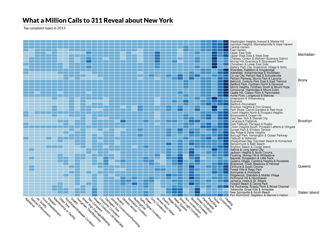
by_dc <- group_by( data, CD_Name, ComplaintType )
s1 <- summarize( by_dc, n=sum(n) )
t1 <- melt(s1)<br />
t2 <- cast(t1, ComplaintType ~ CD_Name, sum, margins=TRUE)
names(t2)[ncol(t2)] <- "Total"
t3 <- filter(t2, Total > 5000)
t4 <- t3[order(desc(t3$Total)),]
t4 <- t4[-1,]
row.names(t4) <- t4$ComplaintType
t4 <- t4[,-1]
t4 <- t4[,-ncol(t4)]
data_matrix <- data.matrix(scale(t4))

pdf("heatmap_cd_by_boro.pdf", width=10, height=14)
heatmap.2(data_matrix,
      Rowv=NA, Colv=NA,
      dendrogram='none',
      scale='none',
      col=brewer.pal(9,"Blues"),
      main="311 Calls by Community",
      key=FALSE,
      keysize=1,
      trace='none',
      offsetRow = 0.5,
      offsetCol = 0.5,
      margins=c(16,12),
      xlab=NULL,
      ylab=NULL)
dev.off()
###Step 4: Adjust labels and titles
I saved the plots in pdf format and brought them into Illustrator where I could work on the labels, adjust the title location, and make the heatmap grid lines more prominent.
Code for this project is available on GitHub at https://github.com/jcp1016/nyc-311

###References
(1) Guide to NYC Neighborhood Census Data: http://guides.newman.baruch.cuny.edu/c.php?g=188226&p=1243123, Frank Donnelly, September 2, 2014
(2) Tufte, Edward R. The Visual Display of Quantitative Information. Cheshire, Conn. (Box 430, Cheshire 06410): Graphics, 1983. Print.
(3) Yau, Nathan. Visualize This: The FlowingData Guide to Design, Visualization, and Statistics. Indianapolis, Ind.: Wiley Pub., 2011. Print.